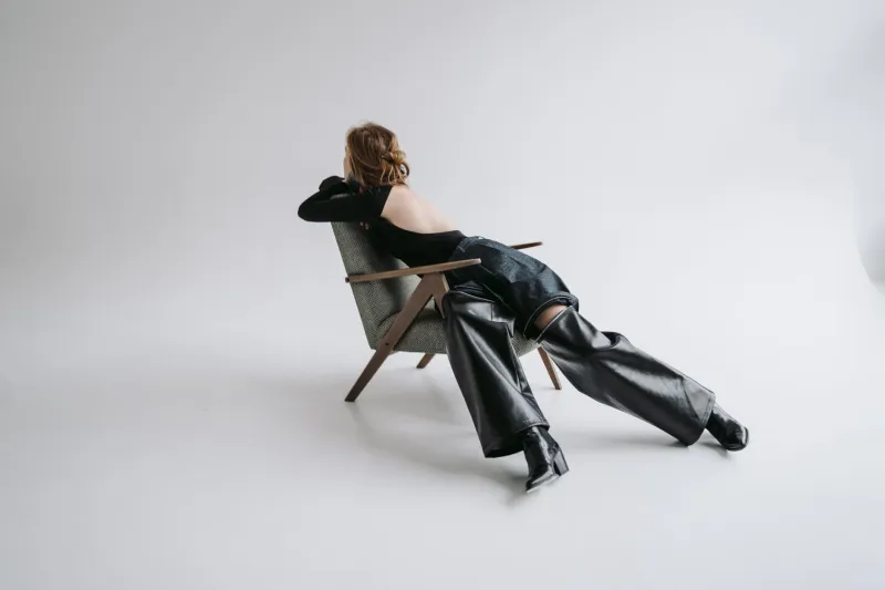
Tonal Living: The Quiet Sophistication of a Curated Color Story
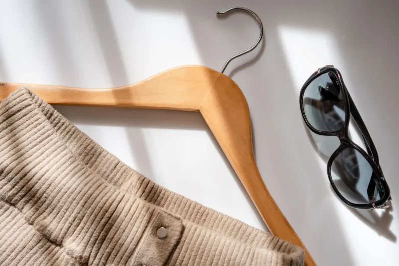
There is a particular kind of confidence that arrives without announcement. It does not shout. It does not compete. It simply exists — composed, deliberate, and unmistakable. This is precisely the quality that a refined color palette communicates, and it is why, across American wardrobes, the language of neutral, tonal, and monochromatic dressing has moved from the periphery of style into its very center.
This is not a trend born of minimalism for minimalism's sake. It is something deeper — a recalibration of how contemporary American consumers relate to clothing, color, and self-expression.
The Psychology Behind Palette Restraint
Color has always carried psychological weight. Research in environmental psychology has long established that muted, cohesive tones create a sense of calm and order, while high-contrast, saturated combinations can generate visual and cognitive stimulation. What is notable is how these findings have begun to translate into personal dressing choices at a cultural scale.
In a media landscape characterized by relentless visual noise, many American consumers are actively seeking environments — including their own wardrobes — that feel quieter. The appeal of a stone-gray coat, a series of ivory knits, or a wardrobe anchored in warm camel and sand is not merely aesthetic. It is psychological relief. Dressing in tonal harmonies reduces the daily friction of decision-making while simultaneously projecting an air of intentionality that louder combinations rarely achieve.
Contemporary designers have recognized this shift with precision. The move toward palette restraint is not a retreat from expression — it is a redefinition of what expression means. When a garment's construction, proportion, and material quality are no longer competing with aggressive color choices, those elements become the conversation.
American Culture and the Evolving Relationship with Color
Historically, American fashion culture has celebrated abundance — in silhouette, in print, in color. The seasonal spectacle of retail, with its trend-driven palette rotations from chartreuse to cobalt to terracotta, conditioned consumers to expect, and even desire, constant chromatic novelty.
What has changed is the growing awareness that novelty and sophistication are not the same thing. A generation of American consumers, many of whom came of age watching the rise and fall of fast fashion's most garish cycles, is now gravitating toward something more enduring. The influence of Scandinavian and Japanese design philosophies — both of which prize restraint, quality, and longevity — has permeated American aesthetic sensibility in ways that are now visible not just in interior design, but in how people dress.
This cultural crossover has been accelerated by the way contemporary designers communicate their work. When a brand presents a collection in a palette of three related tones — perhaps slate, charcoal, and warm white — the visual coherence itself becomes a statement of design maturity. The message is clear: this is clothing designed to last, to layer, to live with.
Building a Personal Color Architecture
For those drawn to the principles of tonal dressing, the process of curating a personal color story begins with understanding one's own undertones and the environments in which one most frequently moves. A wardrobe built around cool, ashy neutrals will read very differently in the light of a New York winter than the same palette worn against the warm tones of a Southern California afternoon.
The goal is not to eliminate color, but to become its editor. Consider the following principles when approaching this process:
Anchor, then layer. Identify two or three foundational tones — often drawn from the warm or cool neutral spectrum — that work harmoniously against your complexion. These become the structural elements of your wardrobe. Layering within the same tonal family, rather than across contrasting ones, creates the kind of visual depth that reads as effortless sophistication.
Treat texture as your accent. Within a restrained palette, texture performs the role that color once did. A cashmere rib knit in ivory worn alongside a matte cotton trouser in the same family of white creates visual interest through material contrast, not chromatic competition. This is a hallmark of considered design.
Resist the impulse to correct with color. One of the most common obstacles to tonal dressing is the instinct to break up a quiet palette with a contrasting accessory or statement piece. Restraint, practiced consistently, is more powerful than occasional boldness. Trust the architecture you have built.
The Designer's Perspective: Color as a Design Decision
Within contemporary design studios, the decision to work within a limited palette is rarely arbitrary. It reflects a conviction that the designer's attention — and the wearer's — should be directed toward form, proportion, and construction. When color is reduced to a quiet supporting role, the cut of a sleeve, the drape of a bias-cut hem, or the precision of a bound buttonhole becomes visible in a way it simply cannot when the eye is drawn elsewhere.
This philosophy resonates deeply with the approach at Joan Design. A garment conceived with palette restraint in mind is, by nature, a garment designed to age gracefully — to remain relevant not because it chases color trends, but because its underlying design language is sound. The color story serves the structure. The structure serves the wearer.
Transcending the Seasonal Cycle
Perhaps the most compelling argument for building a wardrobe around a curated, limited palette is its inherent resistance to the seasonal trend cycle. When your foundational pieces exist in tones that are neither specifically of-the-moment nor aggressively classic, they occupy a kind of temporal neutrality. They belong to now, and they will continue to belong to the seasons ahead.
This is the quiet revolution underway in American wardrobes. It is not a rejection of beauty or self-expression. It is, in fact, their elevation — a recognition that the most sophisticated form of personal style is one that has been thought through, edited, and allowed to breathe. In choosing fewer colors with greater intention, the American consumer is not dressing down. They are, at last, dressing with design.